Chart view
Uh-oh! It looks like your ad blocker is preventing the video from playing.
Please watch it on YouTube
Charts help visualize the vast amount of information in your database. Customize your charts so you can see your data in the way that’s most helpful. You can even put charts from multiple databases into a Notion page to create a powerful dashboard 📊

Note: Everyone on a paid plan can create unlimited charts. Members on the Free Plan can try one chart for free. Learn more about charts availability here →

Note:
Charts can only display up to 200 groups and 50 subgroups at a time (for example, 200 days on the X-axis).
If you’re in a large database, your chart may be a little bit slower to update.
If your database’s sub-items or sub-tasks aren’t reflecting in your chart, you may have to update your database settings to display all items in your database as a flattened list. To do this, open the settings menu at the top of your database and select
More settings→Sub-itemsorSub-tasks. Next toShow as, adjust the setting toFlattened list. Learn more about viewing sub-items here →
To create a chart in Notion:
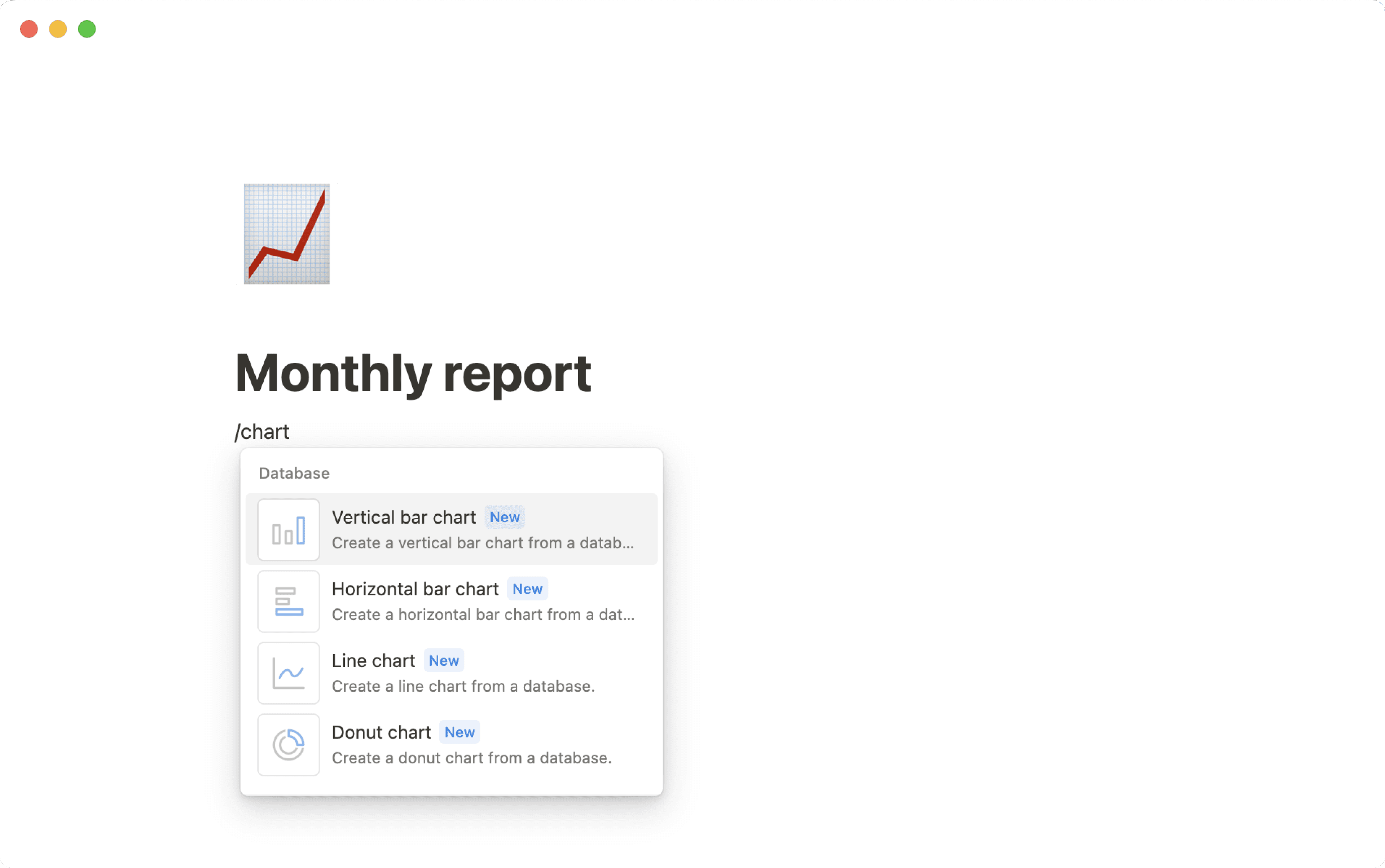
In a page, use the slash command
/chart.In the menu that appears, select
Vertical bar chart,Horizontal bar chart,Line chart,Donut chartorNumber chartLink an existing database, or select
New chartto create a new database.


Note: At this time, you can’t edit database entries from chart view. Use or create another view to edit your data.
Add a chart view to a database
Chart view works with existing databases so that it can take your current database items and visualize them. To add a chart view to a database:
Click
+next to the name of your database or the name of your current database view.Select
Chartfrom the dropdown menu.

Change your chart type
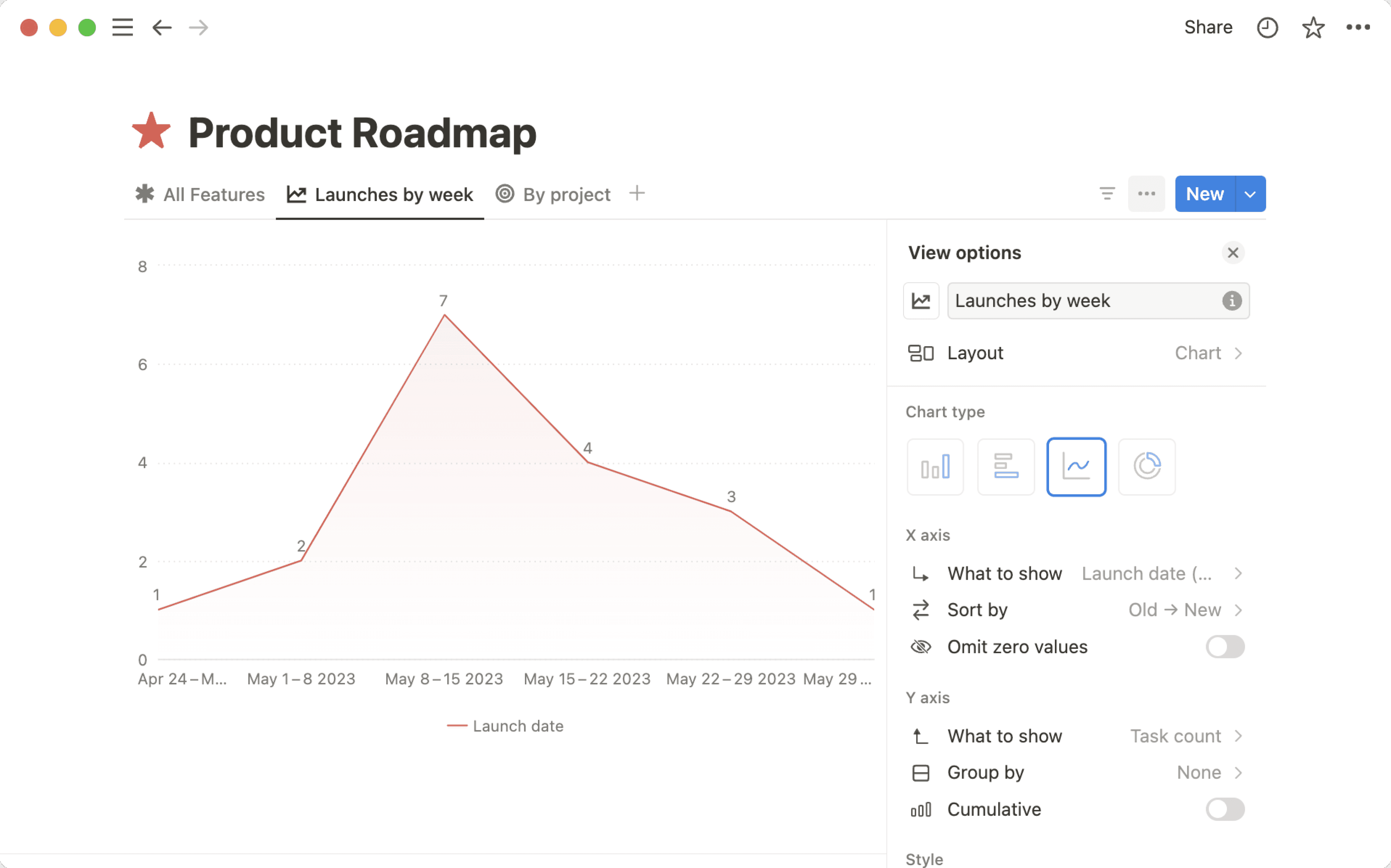
There are several types of charts you can choose from. To change your chart type:
Open the settings menu at the top right of your database.
Under chart type, select
Vertical bar chart,Horizontal bar chart,Line chart,Donut chartorNumber chart
Customize your bar or line chart

Note:
The X and Y axis configurations are only available for bar and line charts.
Your X and Y axes won’t be able to show rollups, buttons, unique IDs, files and media, or formulas resulting in a list of outputs. Certain formulas, like formulas based on relations and rollups and other complex formulas, may cause charts to take a little bit longer to load.
The X and Y axes of your chart can be configured to show you what’s most important. To configure your X axis:
With your chart view open, open the settings menu at the top right of your database.
Under
X axis, you can adjust the following:What to show: Choose the property that should be associated with your X axis. Let’s say you want the X axis to show your tasks by status.Sort by: Choose how your data should be sorted. For example, you might want to sort by ascending status (going from to-do to complete). You can also control what’s shown or hidden from your chart by selecting👁️next to any of the options underVisible groups. For example, you might choose to exclude any tasks marked as complete from your chart if you’re only looking to visualize your in-progress tasks. Anything that’s hidden will move toHidden groups.Omit zero values: Depending on your setup, you may or may not see this option. Toggle this on or off depending on whether you want to include property values for which there are no associated items. For example, let’s say you have a status for paused tasks. If there aren’t any tasks in your database that are paused, you can toggleOmit zero valuesoff if you don’t want the paused status shown in your chart. If you toggle onOmit zero values, you’ll see all of the status options in your chart, even if there are no tasks for some of those status options.
To configure your Y axis:
With your chart view open, open the settings menu at the top right of your database.
Under
Y axis, you can adjust the following:What to show: Choose the property that should be associated with your Y axis. You can also choose to showCount, which would show you the number of items associated with your X axis.Group by: Choose the property that you want to group your Y axis by. You can also chooseNoneif you don’t want any grouping.Omit zero values: Depending on your setup, you may or may not see this option. Toggle this on or off depending on whether you want to include property values for which there are no associated items. For example, let’s say you have a status for paused tasks. If there aren’t any tasks in your database that are paused, you can toggleOmit zero valuesoff if you don’t want the paused status shown in your chart. If you toggle onOmit zero values, you’ll see all of the status options in your chart, even if there are no tasks for some of those status options.Cumulative: You’ll see this option if your chart is showingCountorSumand your X axis property is sorted in ascending order. Toggle onCumulativeif you want your chart to reflect the total amount of information gathered over time. Toggle offCumulativeif you want the chart to reflect the data for the current moment in time. For example, let’s say you have a chart where you’re tracking how many tasks you have completed. You completed two tasks yesterday, and three tasks today. IfCumulativeis toggled on, you’ll see two tasks completed yesterday, and five tasks (two from yesterday, three from today) completed today. IfCumulativeis toggled off, you’ll see two tasks completed yesterday, and three tasks completed today.
Customize your donut chart

Note: Your donut chart won’t be able to show rollups, buttons, unique IDs, files and media, and certain formulas.
Donut charts can be customized slightly differently from other chart types. To customize your donut chart:
With your chart view open, open the settings menu at the top right of your database.
Under
Data, you can adjust:What to show: Choose the property you want your data to show.Each slice represents: Choose the property you want your slices to be organized by.Sort by: Choose how your data should be sorted. For example, you might want to sort by ascending status (going from to-do to complete). You can also control what’s shown or hidden from your chart by selecting👁️next to any of the options underVisible groups. For example, you might choose to exclude any tasks marked as complete from your chart if you’re only looking to visualize your in-progress tasks. Anything that’s hidden will move toHidden groups.
Change your chart style
You can customize the look and feel of your chart. To do this:
With your chart view open, open the settings menu at the top right of your database.
Under
Style, you can adjust the following:Color: Choose a color palette for your chart.More style options, which include:Height: Choose fromSmalltoExtra large.Grid line: Choose whether to add a grid line to your horizontal or vertical axes.Axis name: Choose whether to name your X or Y axes.Data labels: In a bar or line chart, toggle this on to label your data points. In a donut chart, select this to choose how you want your data points to be labeled.Smooth line: Toggle this on to make the line in your line chart curved instead of angular.Gradient area: Toggle this on to fill the space under your line chart with a gradient.Show value in center: Toggle this on to show the value in the middle of your donut chart.Color by value: This option will only be visible for bar and donut charts whose color is notAutoorColorful. Toggle this on to make your data points darker in color as the value increases.Legend: Toggle this on to create a legend for your line or donut chart.
Open up a chart view and you can do the following:
Hover over elements of the chart to see labels.
Click into a chart group to see a drilldown.
Click on a category in the legend to hide groups.
Copy the link to the chart.
Drilldowns
For any chart you have permission to view, you can click into a specific part of that chart to see the data points within it. For example, you might want to see which tasks are marked as P0.
Charts drilldowns currently only appear as table views. If you want to edit a page’s properties from within a drilldown, you’ll need to open the page first.
If you want to save a drilldown, select ••• at the top of the drilldown → Save as view in. Pick a page to save the drilldown to.

Note: You won’t be available to do the following when you’re in a drilldown view:
Select multiple rows and take bulk actions on them.
Freeze columns.
Perform calculations or aggregations like
CountandPercent.Add new database pages.
You can download your chart to share or use elsewhere. To do this:
With your chart view open, open the settings menu at the top right of your database.
Select
Save chart as....Customize the background of your chart. You can preview your chart as you do this.
Select
Copy as PNG,Download PNG, orDownload SVG. Note that these options aren't currently available on the Android app.

Note: If you’re on a paid plan, you can choose not to include a background in your chart — this will also remove the Made with Notion watermark.
If you want to view multiple charts and other database views in one place, add a dashboard view to your database. Dashboard views let you arrange widgets like charts, tables, boards, calendars, and timelines into a single, at a glance layout.
To build a dashboard:
Select
+ Add a view, or click the+next to your existing view tabsIn the view picker, choose
DashboardName the view (for example,
DashboardorOverview)Click
CreateSwitch to
Editmode to add widgets, rearrange them, and adjust row height and widthUse
Viewmode to interact with the dashboard day to day without changing the layout
You can also use global filters in a dashboard to filter multiple widgets at once (as long as those widgets include the property you’re filtering).
Learn more about dashboard views here →.
Everyone can try charts. If you’re on a Free plan, you can create one chart, and if you’re on a paid plan, you can create unlimited charts. Learn more about our plans and pricing here →
If you’re on a Free Plan, you can delete your one free chart to create and use another. Once you’ve deleted your free chart, you’ll need to create a new chart or duplicate an existing chart in your workspace to be able to access it for free. For example, if you delete your free chart from your workspace and then download a template that uses a chart, you’ll need to duplicate that chart to use it.

Note: If you’re on a Free Plan and download a template that contains charts, you’ll only be able to see one of the charts in the template (as long as you haven’t already used up your free chart).
